Data last updated Sunday 07/15/18, 12:27 PM ET
Last 5 goals in the database:
CRO 28
FRA 38
FRA 58
FRA 65
CRO 69
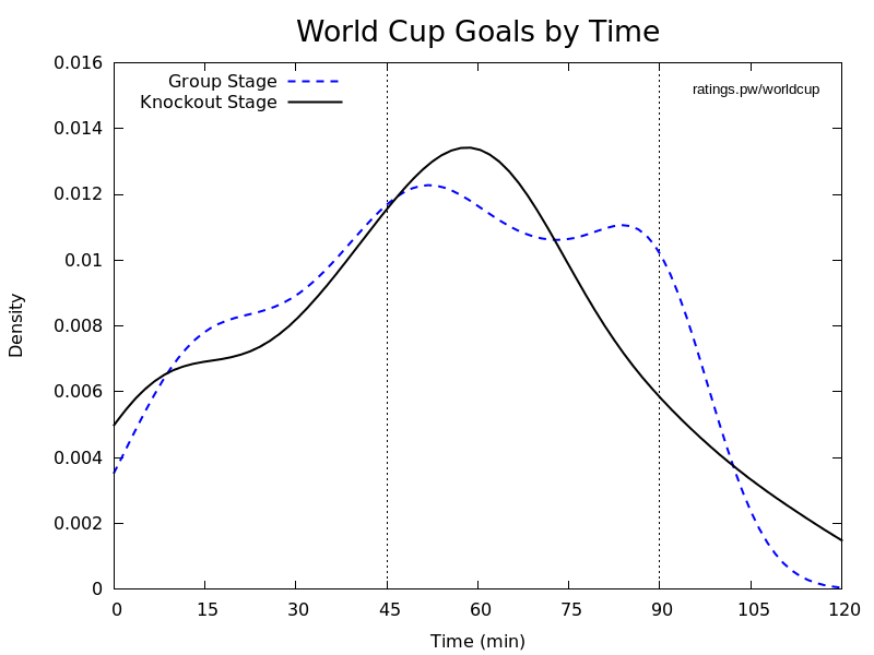
What is this graph?
This graph depicts a kernel density plot of the time of all the goals scored in the 2018 World Cup group stage. It is, effectively, a "smoothed" version of a histogram. The number of goals scored in each 15-minute segment is shown in parentheses, to give you an idea of what a more conventional histogram might look like.
There is a marked spike in goals at the start of the second half, and also near the end of a match. Don't feel guilty if you miss the first 15 minutes of a match--unless Ronaldo is playing. :)
Below, an example of the kernel function for a single goal, scored in the 30th minute. Each goal gets added to the graph with a curve like this, so that the values add to each other but keep the overall graph looking smooth. The value of the density (on the y-axis) will change as the number of goals increases, so that the area under the curve sums to 1.

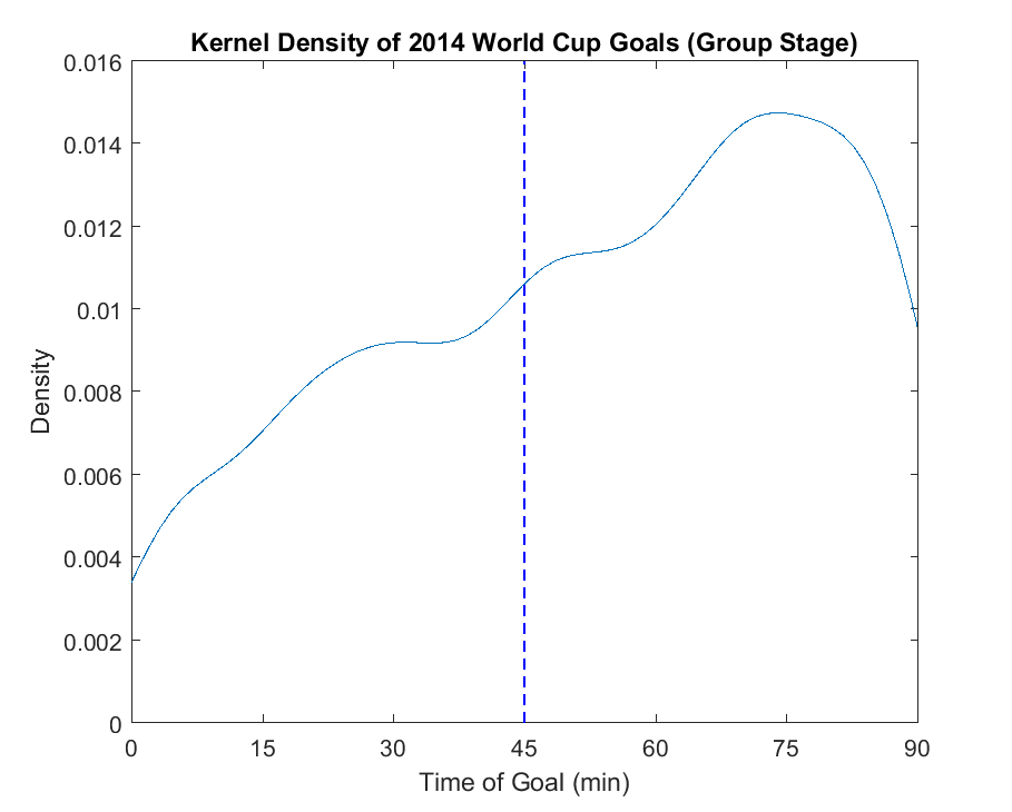
Below, the graph for all goals in matches from the group stage of the 2014 World Cup. Not surprised to see the same distribution developing in 2018.